A new card design for MoraBanc
Reimagining what a credit card can look like

MoraBanc is the third largest bank in Andorra, a small but economically powerful country in between Spain and France. A well-stablished financial institution, it has been working hard in the last years to update and improve its brand from a visual and digital point of view.

After months of hard work, we had created a new visual identity that felt way fresh and current while remaining 100% MoraBanc.
The new design included revised typography, a richer colour palette and beautiful new icons and illustrations. Above all, it introduced a much clearer, airier layout where every element was given ample room to breathe.


A NEW DESIGN PARADIGM
We boiled down the main strategic and conceptual elements of the redesign in a Design System that we called Tramontana, taking the name from the wind that blows from the north of the Pyrenees towards the Mediterranean Sea. The very essence of where Andorra sits on the globe, right in the middle of the mountains but clearly open towards France, Spain and the oceans that surround them.
With Tramontana as our guide, the new cards should also:

Reflect the evolution of the organisation in recent years and convey the essence of the bank to all audiences.

Show Morabanc’s strong commitment to care and detail, showcasing a dynamic yet familiar approach.

Be instantly identifiable as MoraBanc cards, with a prominent presence of the corporate blue color.
MISSED OPPORTUNITIES
The current design of the cards barely made use of the resources at its disposal (typography, icons, photography, layout...) which ultimately resulted in a neglected image and conveyed the feeling that the issuer of the card was more important than the bank itself. There was a clear opportunity to create consciously designed cards that shifted this paradigm.
1. The use of pastel colours give the cards a childish look, the opposite of premium.
2. Inconsistent margins create a feeling of chaos.
3. Generic photography in the background doesn’t convey a differential image.
4. Using the typeface provided by the issuer diminishes the brand presence.
5. The card typology is indicated next to the issuer, reducing the bank’s presence.

With all that in mind, we asked ourselves:
What would MoraBanc’s cards look like inspired by Tramontana?

Introducing the new MoraBanc cards
Cleaner, simpler, contemporary and elegant.
A whole new approach

FRONT
1. Cleaner, simpler, and more personal design, leaving only the client's name on the front.
2. Use of gradients to introduce secondary colours dynamically.
3. Card type near the bank logo, not the issuer, and using corporate typography.
4. Introduction of continuous stroke illustrations that add character and cohesiveness.
5. Consistent interior spacing of 20 points (multiple of 4).

BACK
1. Client information grouped on the back for safety and convenience when online shopping.
2. Use of MoraBanc’s official icons to reinforce brand presence and add friendliness.
3. Yellow-tinted magnetic stripe to create a vibrant contrast with blue, in line with the new palette.
4. Key product features highlighted to strengthen the value proposition.
5. Use of natural language in all texts, avoiding technical lingo.
A versatile system
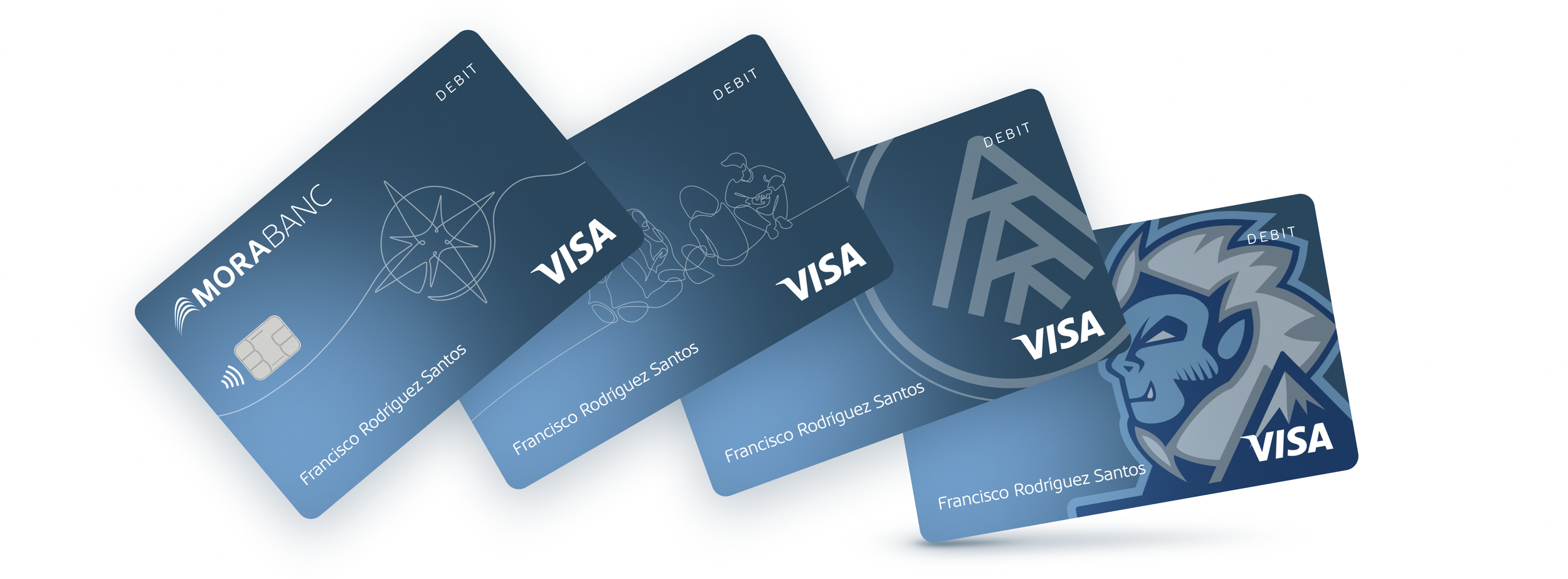
On the debit cards, the sky-blue to navy gradient creates an elegant yet approachable composition. Combined with the placement of the card type in the top-left corner, it makes identification easier.
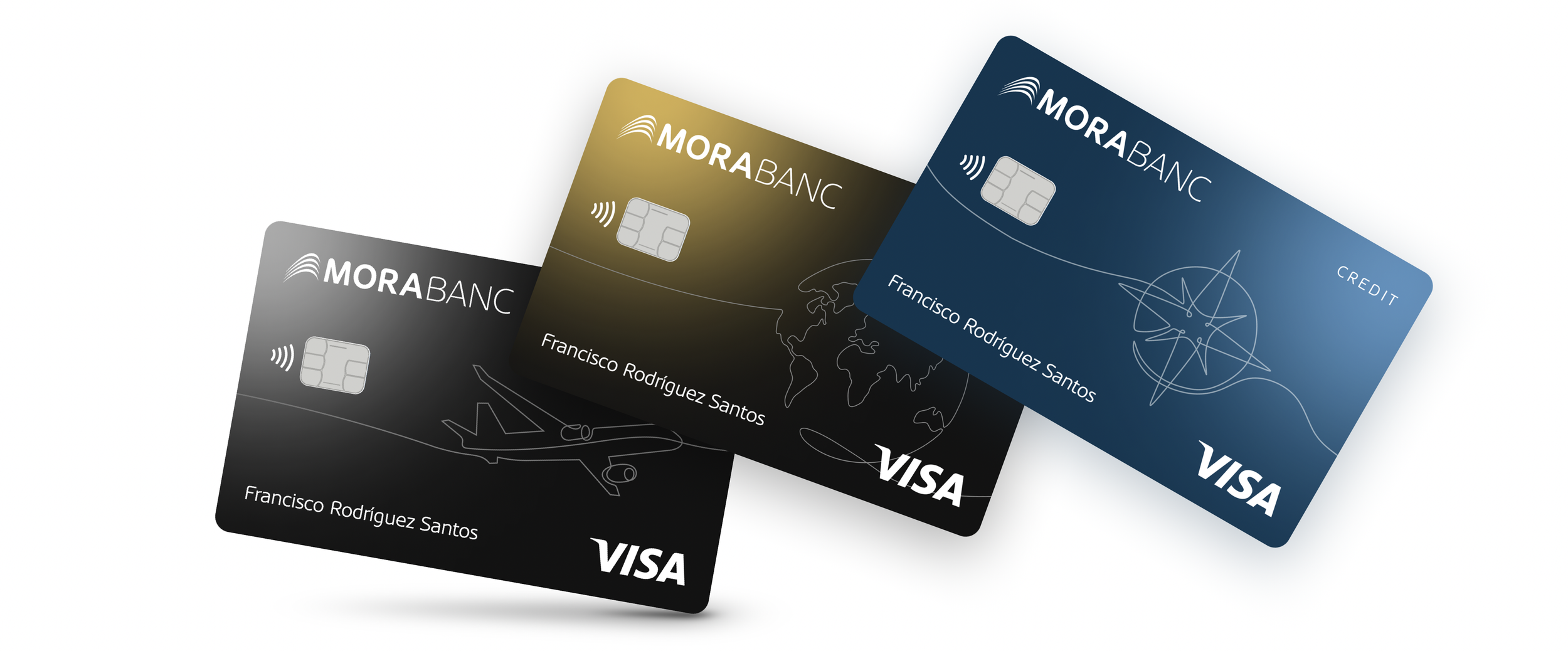
For the credit cards, the gradient is inverted, giving more visual weight to the darker blue to achieve a more premium feel. On the gold cards, this tone is pushed further through the use of color and illustrations.”